Tuesday, December 15, 2009

Digital Story Telling duex


Hey class. So this would be my second post on digital storytelling and guess what? I still think those sites listed (hope I didn't offend you Jeff) are boring. And get this, when I had that optimistic pop of creative thinking flow through my brain after seeing the "I have crabs" story, I found a longer, deeper, also extremely interesting story in its own right, on the same site.


I picked this particular story because my friend morgan said, "hey look, this is my teacher, I think I have a girl crush on that woman". I chuckled, watched the video, and realized why Morgan has a girl crush on this woman; she is one amazing writer and one amazing storyteller.


...please turn your cell phones off and no crying babies...


Megan Stielstra from 2nd Story on Vimeo.


This was just like the last video I wrote about, in that I sat through the whole thing and didn't for one second think about trying to find a different story. I was immersed in this one. Again, I know, with the whole obvious narrative; but in that respect, I think one of the reasons I found this story to be so interesting is because the plot is not obvious. You have the big, in the present, I got a book on my desk story, and the mini, in the past, moral issues, messed up students story.

So no, there were not multiple people narrating it, but I found it just as, or more interesting than the first story. This is partially because of the way she set up her story, described the characters, figuratively put your brain into this point of her life so you saw it. And I think, for one, that there were multiple people narrating. You got the funny, I like Grey's Anatomy Megan, the optimistic young teacher Megan, the struggling, conflicted teacher Megan, and the I am now the teacher I am Megan. And I say these are multiple narrators because these weren't non-tangible characters/strangers in her story, she was right there in front of all those people stepping into the character that was herself and playing that part so it was like there were four different people telling a story.


This is something you can't do with traditional storytelling in a book sense. The author can't write the same story, starting with one character and then suddenly making that character into someone else, changed, and then suddenly doing that again, and again, and again; without writing a book longer than 13 minutes worth of reading time.

Another advantage I see to this particular way of storytelling is I couldn't attend that live event (since it obviously was not originally digital storytelling), but that's not an issue because I can see the same facial expressions, hand gestures, hear the same tone of voice on the web. I like that. I have a busy schedule folks but I still like to enjoy the creative work of others in and out of my major.


And like I said before, I found colossal value in this story because I wasn't imagining it for myself; taking the words and creating a picture of my own, she was doing it for me. I appreciate that because it makes it more real. It makes this story soaking with adjectives and phrases and references real in the fact that this actually happened; it wouldn't be a true story if my brain was making up some guys named Dan and David who said fuck a lot and wore huge headphones because my brain would come up with something completely different than her experience. So by seeing this story online, representing a live performance, seeing her face and hands moving, I get her experience.

Digital Story Telling Part 2


Storytelling, or at least the wikipedia essence of it. You've got a little bit of your history... some oral traditions... some aesthetics to follow. But you know what? I really just don't find wikipedia's definition interesting. It doesn't work for me.


Kind of just like how I found lonelygirl15 to be uninteresting. I blame it on her acting, maybe the "fractured narrative", or maybe it was just the fact that her boobs distracted me every time my eyes glanced at the screen.

Kind of just like how I found "What should I do with my life" to be uninteresting. I blame that on the monotone stranger speaking into the microphone for the voiceover, maybe the, again, "fractured narrative", or maybe it was just the fact that I was asking myself, "what should I do with my life?" if I seriously had sat through the whole thing.

Anyway, I happened to be at my friend's apartment and she happens to be a creative writing major. Nifty eh? She pointed out this website. Very cool by the way. So I picked this video that I would like to share...


2009 2nd Story Festival from 2nd Story on Vimeo.


First of all, Go Milwaukee! Second of all, I didn't think twice about trying to dig for another story. I didn't even know what the story was about before I thought, "I like this. This is going to be my topic."

"I masturbate, I masturbate, and I masturbate"


I truly enjoyed this story because, one, it was narrated by multiple people, two, its about something that is relative to my age group, three, it was funny, four, it was an obvious narrative (I seem to have figured out I like those better).

And I realized at some point, this is the longest conversation I've ever had with a woman that's not my mother.


And people might think, "it's only three minutes long, what's the value in that". But I think in and of itself there is a colossal amount of value. Yes, this is personal opinion, but seriously I just got done with the hardest day of my finals, in serious need of some whiskey and nicotine; but this made me laugh, it made me interested in actually writing this post which I didn't think my brain had the capacity to do tonight, and I find a tremendous amount of value in that.

This is it, I'm going to be having sex, I'm getting laid


Going back to web 2.0 storytelling and traditional storytelling, I've found another plus for the web. You can sit down in front of your computer, pull up some short storytelling clips of something you're in to, and laugh... or cry... or whatever mood you feel like being in. I'm not the person who has a stack of books with short stories, so the web is a much better place for me to go.

Fake it till you make it


On top of that, you get the hand motions in the video. Yes, I can read a short story and somewhere in my deep down imagination station, create the character the story is describing, but it's not the same. With this particular tab in digital storytelling, you get these emotions pushed on to you, you don't have to think, "well hey there's this dorky college kid, okay, and he's never been laid, okay, so he may look like this, okay, and he's facing this stern faced woman, okay" etc. It's already there for you. You're getting someone's, or multiple in this case, interpretation of the story, not just your own. And especially in this case, the interpretation of many people which I think is catchy and interesting.

I gotta crotch full of crabs

Thursday, December 10, 2009

Anything you can do, I can do better


So this week we’ve been looking into web 2.0 storytelling. My first post I wrote about whether I thought this new type of storytelling is, in my opinion, actually storytelling. This post will be about what web 2.0 storytellers can do that conventional storytellers can not.

First of all, my fellow new media writers, the biggest difference I see are videos. Any book, children story, short story, poem, etc. can have illustrations. These are intriguing, they help people visualize the story, but it is not the same as including a video in a virtual story. Whether it’s a written story with an embedded video or a story ‘embedded’ into a video, this type of media can bring new and different interactions into play.


Side note - so this isn't the only way you could go, I was also talking about storytelling as in reading poems, reciting short stories, and stuff along those lines.


For example, children like illustrated books, but they don’t really interact with them from my experience. The interaction I’m talking about happens when they watch, for instance, an Elmo video and Elmo asks them to dance along with him. Reading a book about Elmo dancing does not call for the child to dance. It’s not the same type of interaction. Having this type of web storytelling can be interactive, can add different graphical elements like flash, and can call for more attention. A video can compliment a story and conventional storytelling usually can’t include a video.

On the flip side, web 2.0 storytellers can include a video with their story, but they can’t do live performance. Sure, they can record themselves telling their poem or short story along with have the text on the web, but conventional storytellers can literally gather a group of people, recite their story, maybe have a screen in the background with images, and get the audiences’ attention that way.


This for instance is a live comedian performance by my friend Victor which I consider storytelling. Yes it is on the web, but is it as funny on the web? Do you get the ambiance of strangers, beer, and a stage? No.


Another thing that web 2.0 storytellers can expect when it comes to video, images, and live performances is the personal environment in which they are telling their story. A person on the computer can be at home, at a coffee shop, somewhere where they feel comfortable, and fully enjoy the extent of the story. They can be by themselves, they can be with friends, they can bring it anywhere, but it is the comfortable personal ambiance and portability that sets web 2.0 storytelling apart from the conventional storytelling.


On another flip side, conventional storytelling in the context of live performance or video and images brings you to, most likely, a comfortable audience. When I think of going to a live performance I take the location into consideration. I wouldn’t go somewhere I thought would be uncomfortable. The plus side to the conventional storytelling would be that it brings you out of your personal element into a new place and prepares you with open ears to hear the story. You can’t bring the story with you, watch it with someone later, but I feel like when you go to a live performance it is like you take in more details than if you can watch and re-watch the story on the web.


So basically, I feel like both the web 2.0 stories and the conventional stories have equal pros and cons. I feel like in both contexts you can basically do the same things just in different ways. Depending on what you’re looking for or what you’re doing, you might chose either one. Conventional storytellers can’t expect to get the visual aspect all the time and web 2.0 storytellers can’t expect the full on effects of a live performance. 

Saturday, December 5, 2009

Notions


After reading this website, Web 2.0 Storytelling, the emergence of a new genre, I had to think about storytelling for a second. Thinking back, I've really always thought storytelling was more of a verbal process a mother does with her child before she goes to sleep; more intimate. Telling a story just strikes me as childlike.

But Web 2.0 has taken this image of storytelling and twisted it into something almost completely opposite. Instead of the intimate closeness you would feel to your mother before bedtime, Web 2.0 expands the notion of storytelling into basically more than any of us can imagine or write about.

For instance, I've learned that stories don't necessarily need an ending. It seems that with Web 2.0 once person can take a picture and then a different person can comment on it and then a different person will comment on that comment and then a different person will make a whole new comment. So it really is like a never ending story with people giving feedback and opinions all the time.


The one thing that struck me really, was not the websites with the virtual, almost interactive, multimedia storytelling like this one, but was actually taking into consideration that tweets can turn into stories and giving a classic book author a facebook page and considering that a story of him.


But I looked at these sites and I really do agree with the thought that, yes, Shakespeare facebook and Alice in Wonderland tweets may be a legitimate story in someone else's eyes; most definitely not a traditional one but from what I've seen these sites and multimedia things do include all the ingredients to be a story, minus the ending sometimes (but really you should always anticipate one, it just may not be there anytime soon).


Personally though, think that this type of storytelling is a little on the line though. Having a Shakespeare facebook is hard to believe as storytelling because one; it has limitations including that it was photoshoped so the story doesn't really have a beginning. two; there isn't a substantial plot or some sort of writing device that draws you in. Honestly I just think it's too "on the surface" meaning it doesn't have enough punch or plot to make me want to keep reading.

That's the whole point of reading a book or hearing a story; so you get into it and want to know what happens. But really, I don't care what happens to facebook Shakespeare.

I think my final opinion comes down to believing that multimedia and digital storytelling over the web counts, commenting on multimedia and digital storytelling counts too. Multiple authors count. But writing a personal page to a dead playwright is more like creating a personal sim, you'll just make them do inconsequential things, not preplaning some ultimate destruction or something to make the plot interesting. Same goes for the Alice In Wonderland tweets. I find them slightly more engaging but I feel like they are too sporadic to really give you any substance.

That's what I want in storytelling; substance, something for my brain to grab onto and kn aw on a little bit. This is why I liked the mini virtual storytelling. They were short, sweet, and engaging.

So to wrap it up, I found it an interesting theory, in my opinion, that some of those sites could count as storytelling but like I said, it was very interesting to take a look at it like that. It really didn't change my notion of storytelling dramatically. I still think bedtime stories are the ultimate storytelling. But what pushed my narrow minded idea of storytelling outward was thinking about a virtual short story mini movie or something that ended before it ended and then a huge amount of people commented to make their own ending. Now that would be cool, I would consider that the storytelling they were describing that in the a new genre page. It's on the web, it is surrounded by an active participating community, and it has many authors and multiple interesting endings that would engage my attention. As for anything else, I think it's just slightly too outside the box to be considered storytelling.

Friday, November 27, 2009

Dan Schmidt, Across the Airwaves


So Across the Airwaves is a blog about recent/not recent tv shows that have made an impact on... something. That something may be a group of writers, a group of creators, a group of crazy teentastic vampire fans, etc. I really like his blog for one because of the flow.

There is definite structure; you have the intro of the show, a little background, and the integration of the effects of the show on the outside. I find his content interesting because it seems like he points out these little plot things or character things that make these big effects that I would really never realize until someone pointed it out.

But anyway, the color scheme. I like the layout he chose. I'm a big fan of circles and the pre-designed layout has a good color scheme. I feel like the colors definitely go along with his content because there is always a level of mystery/surprise/drama in tv shows and I get that feeling from it. My only issue with the color scheme is that sometimes when I read online, I highlight the lines of text to make it easier to read and I could not do that with his blog because the background of the highlight is a light color but the original white words don't change to a dark color so it makes it impossible to read. But all and all, good color scheme, relevant vibe, I dig it.


Lots of pictures. Dan uses lots of pictures. I love it. He has pictures that have to do with what he's talking about and he has pictures that share a quality with what he's talking about. It makes his posts visually diverse. Not only that, but the different visual ideas expands the brain when your reading it. When reading a blog I feel like people just take what they get and by including these semi-off-exact-topic pictures it will lead the brain into a new direction while still keep them hooked on what your saying and therefore making the post more fun to read.


Lack of emphasis. I didn't really see any use of italics. I'm not sure Dan needs them in his blog because he doesn't really get worked up about stuff. He does bold things in some places which I think is probably enough. I feel like all he needs is to differentiate between the regular text and the word he wants to point out and the bolding it does that. On the other hand, I would like to see something that works him up, where he needs italics. There may be a few instances when he talks about how this or that tv show effects writing or when he talked about time slots in his first post and how he doesn't know if he can get a job in tv. I think that's something that needs emphasis.


Da Font. So, as I've said before, I think most blogs need a san serif modern font. In Dan's case I think the san serif works extremely well with his subject matter. There was one instance where he used a serif font and it looked completely clunky and didn't have the readability his other posts had. I felt like it was a big difference.


Are you witty enough? As I was reading through Dan's blog I felt that this shows the difference between my blog and his and how that relates to Trevor's. As I was saying in my previous post, I feel like Trevor needs a little umph, something more. My blog, I feel that it is natural and relevant to give a lot of umph. In Dan's blog, I don't feel that a lot of umph is necessary, I actually think he has a very good balanced between the two. There is sometimes an underlying sarcastic tone or even an underlying tone of excitement that makes reading his blog more enjoyable. You can really get the feel of his tone throughout each post even though it's minimal. That small tone that fluctuates throughout his blog makes his blog interesting despite what the content is. It's like a buffet table, I get a little bit here, a lot a bit there, and it's delicious.

I think that ending comment said enough. Out of five, I give Dan a 4.5, more out of personal opinion than complete objectivity. It's maybe not my flavor of tea meaning I like tea so yeah I'll take a cup, but some variation to the subject matter, maybe the amount of underlying tone, something that would probably make me want to read this on a regular basis. Right now I think I could look at it every once in a while and scan the titles for a show that I'm interested in. But as a blog I find it very nice. It's got a nice flow of information, it's got great and interesting pictures, it works well for what he's going for. I like it.

Wednesday, November 18, 2009

The Credibility of Yelp


So after reading this article on Yelp.com, you really have to ask yourself if this website that makes or breaks a business is really everything it seems to be. In the ideal world, Yelp is there for customers, consumers, and your average Joe to visit when he or she wishes to write their opinion on a specific place for everyone in the world with an internet connection to read.

The problem this article brought up was, can Yelp be trusted? As I'm sure you read, mom and pop stores have reported basically harassment from Yelp. Why? For the money!!! It's always about the money. Basically, if you need a recap, these moms and pops are saying they get constant calls from Yelp employees stating that they have a few bad reviews and for 299$ a month they could either move those posts or remove them altogether.

The interesting part was that after saying no to these Yelp representatives, more bad comments seemed to show up on their Yelp page. Well isn't that just the darndest coincidence? As the article reads...
Because they were often asked to advertise soon after receiving negative reviews, many of these business owners believe Yelp employees use such reviews as sales leads. Several, including John, even suspect Yelp employees of writing them. Indeed, Yelp does pay some employees to write reviews of businesses that are solicited for advertising. And in at least one documented instance, a business owner who refused to advertise subsequently received a negative review from a Yelp employee.

So this is obviously just another one of those money hungry purple mom and pop business people eaters stomping around town strangling the breath out of small businesses. The part that makes me really angry, if any of this is true, is that these employees call to get businesses to advertise aka pay to get their bad comments taken down; if they don't, Yelp supposedly and probably has their own employees write more bad reviews so maybe next time they'll change their answer. Well, as the article points out, not all businesses are ready to believe that Yelp can strangle them and they keep saying no, trying to survive in a tumbling (hopefully slightly stabilizing) economy. Then at the end of it, since they don't pay to advertise, their store goes out of business because the entire world checks Yelp before setting foot anywhere.


So either bow to the review god or walk the plank to financial disaster. So in the credibility closet, based off of this article, Yelp is not a credible source of consumer reviews because they care more about money than honestly trying to help the community venture somewhere nice, with good service and good people and good atmosphere. Also, the reviews cannot be counted as credible anymore because Yelp may pay people to write them.

Even not based on the article I question the credibility of the reviews because say I have a friend named Bart. Bart works at a tanning salon, flaming, my best guy friend so I worry about his existence. Wanda is the twat that works down the street at the competitor tanning salon, hate her guts. In a totally unrelated circumstance, the two find themselves at the same store, trying to buy the same sweater. Bart gets there first and Wanda is furious. So to get Bart in trouble at work she writes a nasty review using his name and the name of the place. On top of that, she makes an alias and does the same thing.

Even though this had nothing to do with tanning, service at the salon, anything at all, the business is still going to take a toll because of a personal vendetta. I feel like people may do this more often than we might think which makes, minus the whole article deal-io, Yelp not necessarily the best place for reference.


I'm going to stick to the old school; word of mouth.

Tuesday, November 17, 2009

Yelp and its Features

"You're looking smart today, Andrea" is the first thing I read when I directed my browser to the famous, maybe lightly infamous site, yelp. So obviously, their first and foremost feature is to compliment the guest. So, as many of you already know, Yelp is the place where you can write a review about a store or restaurant you've been to. Tons of people use Yelp; tons of people love Yelp. People probably plan their days around what this website has to say.
Why? I would say that the first reason is probably because you can get a review on almost any place in America. Second, I would say is that they have tons, yes TONS, of features.

Besides compliments, their homepage has a reviews near you box.

Where, as you can see, people have recently written their thoughts and opinions about places in your town. I personally like this feature. It seems interesting to me that I can go to this website without an idea of where I would like to eat/shop/whatever and get some fresh ideas (but based on that article I'm not too sure how much I like that concept since these spots are obviously paid for). But you know, if I hadn't read that article and since I have no prior knowledge to the subject, it would seem to me that this feature was a keeper.

Another feature they have, though I think it may be a little mute, is you can create your own profile. You can, much like facebook and all the other SNS out there, add a picture, say where you're from, add a nickname, make lists of your favorite places, invite and have friends, and of course, showcase your many Yelp contributions. I think the only helpful thing of the profile is to keep track of the posts you've made. If I was looking at Yelp for some guidance, I wouldn't be worried about where the comments came from.

Next, you can have discussions with people on pretty much any topic out there.


If you can't see, this one is about invisible TV characters. You can see the people commenting with their profile picture to give them some sort of cyberspace identity. On the left you can see the different discussions you can get into.

Another feature they have is messaging. I've had some experience with this one. I like this feature because after I wrote the review in response to a different vicious review made about Family Grounds Cafe, the owner sent me a message saying thank you which was rewarding that my review was taken to heart. On the other hand, the original attacker also sent me a message which was rewarding in the sense that I actually laughed out loud.

Then the last pretty cool feature is the events. Not only just events, events that are in your area. And it's right in the front, easily assessable, waiting for you to click on it.


I don't know, I guess we have Columbia e-mails and posters/advertisements all around the city for that but whatever, it's there if you want it.

For the most part, those are the only features I thought were good in some sense. Sorry if my tone is kind of mellow, that article kind of makes my head spin on things like, you know, today's morals, the fact that money buys everything, the manipulative existence of huge companies, global destruction. So be wary because, as they say, not everything thing is what it seems (spooky 1970's Halloween music here).


Thursday, November 12, 2009

Organization of Virb: the Social Network Site

Virb, I feel like, is organized in a very modern way. It might just be a visual aesthetic for me but I like how it isn't the average five links spaced out evenly at the bottom to direct you around the website.


On the main screen before you sign in, it is easy to see where to join if you aren't already a member, where to log in if you are, and where to see the tutorials if you don't know what you're doing. This probably helped the website create a larger or maybe more diverse (age wise) community because I could just see an older, semi-internet-illiterate person being able to sign up for this site because of the way the main page is organized.

Once you log in, your main page is pretty much organized in the same way. It's clear, concise, directs you where you need to go without having to think about it too hard. The headings are welcome, activity, manage, community, you.

The welcome tab is basically a page where they redirect you to the tutorial videos. Also, they have  nicely designed information on whats's new or what are some of the main features you should use. It's pretty standard but it's also nice to look at because of the design.


The activity tab, at least on mine because I haven't posted anything or created any groups yet, shows the recent activity in the general community kind of like the facebook home page has constantly updating information on your friends. What makes the organization of this website simple is the fact that you have these five tabs, and then if you click or roll over those tabs you have some sub tabs and on this particular page it includes contributions, comments, likes, groups. This will show you your own contributions, you're comments and those of others on stuff that is related to you, who has liked your stuff or liked stuff you have showed interest in, and the groups you are in and what is happening in them.


The manage tab shows you what changes you have made to your profile. As sub tabs they have photos, videos, text, status, quotes, links, audio, and feeds. This is where you can manage the contributions you have made with adding or deleting them, cropping, what group you want to put it in, etc.

The community tab is where you can see the relationships you have made. You can view your followers, or people who want to see updates on what you post, who you are following, or what new things people you are interested in are doing. Also you can see your circles. This is an interesting application type thing where you and selected friends or "space-internet" friends can make a circle of people and if you want to view specically what's going on with those people, you can just click on the circle. Then there are your standard messages, announcements, and messages from the groups you may join.

The you tab is just what you want your profile to look like. They are in the process of creating some new skins, and there is the option of submitting your own design to them. On top of that, you not only can use the standard ones they have, but you can make your own just for personal use which I think is a pretty awesome feature. I think it steps Virb out of the box a little more than other community art websites.

Wednesday, November 11, 2009

Purpose of Virb, the Social Network Site

So I clicked on the first link we were given to do a little poking around beforehand. I saw that they had categories, like art for instance, and I was like oh! well I guess I never thought of social networking sites as being art orientated. Then I scanned the possibilities and saw that they had deviantART listed. I totally was going to pick that one but since I've already been there I thought I would use it as a last resort. I wanted to choose a site that was not professional stuff like the first couple I clicked on, but made by, our favorite word, amateurs.

Then I found Virb. It interested me because it was not only for photography, design, and fine arts, but also for audio, video, and companies, besides the regular personal profile you can have. The other cool thing I looked at were the instructional videos which I actually found pretty helpful.


Signing up for Virb is crazy simple: it basically tells you to do the whole regular shpeel, name, email, social security. Kidding. But what I thought was interesting were the different options you can choose for your profile. First there is the personal profile. It's made for individuals who wish to just have a profile, who "tumbl", who blog, who photo-share, etc. Then there is the audio profile which is for musicians, record labels, comedians, and podcasters to name a few.You can also choose the portfolio option which would be for designers, photographers, filmmakers, and it does say bloggers which I'm not sure why it wouldn't just be on the personal one, but whatever. Last, you can pick other, which is for companies, brands, products, or organizations. '


Once you sign up, you have your profile. On all the pages, which is another feature I like, is the "virb bar" which has an explore pull down menu where you can pick what media you would like to explore that the virb team picks out beforehand as some of the stuff they like best. This would definitely help in generating a community out of strangers who sign up for the site.


Another plus: in your homepage you have a "follow" like blogger where you can see snippets of other people's twitter imports, things that are being liked on the site and content that's being added.

Basically the reasoning for this website is very specific, but the site itself allows you to explore the content in so many different ways. The point is to have fun, share and post your artwork in many different medias, and to make connections with other artists. The bigger idea is to get all the different artists out there to come together. Like I said before, deviantART deals really only with photography, fine art, and graphic art. I think virb probably came out saying "we're going to round up the whole art community because everyone plays a part in creating art and collaboration is important. I think collaboration is important too and this site is great for that. You can comment, message, like things, group artists together, organize, and display yourself.

If you don't have your own portfolio site, if you don't have time to get to the portfolio center, I would do this. They have some cool skins/layouts. I'm even going to consider keeping mine, of course depending on my crazy life/lack of time.

Wednesday, November 4, 2009

More Questions on CafeMom


Official or unofficial? Good personalities or machines? Worthy or unworthy? 
These are some of the questions asking about the site CafeMom.

Like I said in my last post, CafeMom is obviously for moms. When it comes to being “official or not” I think it’s just as official as facebook is. There aren’t any slang words or phrases that a particular ethnic group or age group might use. But its not totally governmental perse. It’s not like the official copyright laws I read on the web for our last assaignment. 

It’s friendly, that’s the word I’m looking for. It’s the kind of site that invites any age or ethnicity to come and join and relish in the fact that you’re preggos or already have the little eggos. So no, I would not say it’s official because that would most definitely turn people away from the site, but it’s not like someone made a website and didn’t double check it or used their own personal language either. It’s friendly.


And I think that kind of characterizes the moms on the website too, for the most part that is. From what I’ve seen, these moms like giving help to others and reach out to others. It’s like a culdesac neighborhood of moms who all know each other and like to give each other cookies every now and then. Moms are usually nice people and if you’re a meanie mommie, you probably wouldn’t join a website like CafeMom. But on the other hand there are those up-to-do moms, as I call them, who don’t work (sorry this is very stereotypical) who get manicures every week and their hair done, and most likely have a nanny half the time. I would say that’s a major stereotype but I think it’s true. These kind of moms are also on the website. I think they kind of bring it down actually because they are the ones who get on other mom’s cases about their parenting instead of giving some good advice. But for the most part, I think the moms are lively, happy, regular, friendly moms. 

I kind of got a sense of the character of the moms by the journals they posted. And to answer the 

question on the member-generated writing, these moms come from all shapes and sizes of educational levels. There are people who don’t spell check and have major grammatical mistakes and there are the master’s moms who write like they’re at Harvard. It doesn’t really change the feeling I get from the moms though (back to the friendly) it’s just different styles of writing. I think that’s a mom thing, no matter where you come from, if you’re a mom and she’s a mom, you’ll probably going to get along, at least for the first play date.

I think all of these combining features on the website, the backgrounds of the moms, and the personalities of the moms make this site worthy. It’s not about whether the site has been made well, has the best design, is the most official, it’s the ambiance that is created by the tone of the website voice and the personalities and connection of the moms. If there were mean, egotistical moms that made a mean egotistical vibes, then no, this site would not be worthy of anyone normal’s attention. But it’s not. It’s useful in the fact that it has news forums about kids, advice colums about kids, activities for kids, and also the connecting moms sharing advice and ideas. It just creates a good ambiance that is worthy of a good person’s time.


Monday, November 2, 2009

Cafe Mom!

A social network sites is a web-based service that allow individuals to (1) construct a public or semi-public profile within a bounded system, (2) articulate a list of other users with whom they share a connection, and (3) view and traverse their list of connections and those made by others within the system.

This is what our link wrote on social networking sites and I would say that cafemom.com definitely falls under that. CafeMom is a SNS that is obviously for moms. You have a profile that you can load a picture onto. You can write how you're feeling in your "thought bubble" (much like facebook). It is a "bounded system" meaning that there are limitations on what you can do with your profile and what you can see on others' profiles. You can have a friend list and see your own friends list of friends as well. So yes, I would say this is a SNS.

Goals.

I would say the goal of this website is to connect moms with other moms. Their smaller goals I think would include helping out new moms, advice for any mom, activities for moms, games for moms, etc. Maybe the ultimate goal is to help moms relax, but then again I think that is a little backwards because if I were a mom and I had some relaxation time, I would most likely not want to play games about children and write posts on my child and load pictures of my child...seems a little repetitious.

I think this page is great for those moms who love to show off their children; but I would say it isn't that distinct from other SNSs except for their wide variety of groups like, advice for moms, 24/7 chat 4 moms, and teen - young moms (I was a little offended!). I think these groups are probably the main driving force for this website because like I said, other SNSs offer the same photo sharing, chatting, game playing, blogging, etc.

Offers.

I feel like I've already kind of dived into this topic with you guys above but anyway... First off, there is photo sharing. I checked out a few mom's photo's and you can basically upload A photo and then it will show them all in order of time uploaded. It's nice because, since this site is all about the bouncing babies, that you can see the progression of growth that all mommies get excited about.

Next, there's a journal part to the website.

I have a few "bones" to pick with you, America.

#1. Since when is a "scary" costume TABOO on Halloween? We went to the "Mall-o-ween" with our toddlers at about 5, because it was easy and we knew we would take them around our neighborhood later. People were giving my son, husband, and I dirty looks for our costumes.. and PRAISING my daughter for hers (fairy) while IGNORING my son completely. Her candy bag weighed double when we got home.. and hers was full of nicer candy, his was full of the crap from China and stuff that I wont let them eat so we donate to the shelter. Nice.


I think they BOTH look adorable and worthy of equal treatment.. I was pretty disgusted by how many people went "oh, hi.. here you go" to my son and gave me a dirty look.. and then went "OMG HI CUTIE! OMG YOUR SO CUTE! OMG! HERE YOU GO! AWWW HAVE TWO!!" to my daughter. Yes.. shes cute. But wow, bash to my other kids ego much?

#2. Whats all this "Safe place" talk? "As long as we go to a safe place..." meaning what? A person who lives in a smaller house than yours is going to kidnap and murder you on the spot? You are going to get shot on a street without streetlamps? I don'tget it. Every year we went trick or treating at my friends aunts neighborhood before going to my grandmas neighborhood.. her aunts neighborhood was a.. GASP.. trailer park! And guess what? It was the BEST! The best candy, the nicest people, and just about EVERYONE participated. It was probably the SAFEST neighborhood we could go to, because there were lots of people and no cars racing past. I mentioned this the other day and someone sneered "ew.. a trailer park?" ARE YOU SERIOUS? Grow up.

#3. WTF is Trunk-or-treating and why does it insist on ruining halloween? When I was a kid, you wanted candy.. you had to work for it! Trudge up and down those hills in your costume, knock on doors. Our kids are so fat and lazy now (or our parents?) that we cant even knock on doors? We have to walk from trunk to trunk in a parking lot? We passed THREE trunk or treating events.. and the consequence of that is the $20.00 of candy we bought for trick or treaters is just sitting here still.. we only had 5 groups of people knock on our door.. maybe 20 kids total. We gave out big handfulls but still have a ton left over. Last year we had about 100 kids at least. What HAPPENED? Last year it was cold and rainy.. this year warmer and dry. So it wasn'tthe weather. I really don't care if this offends anyone.. There are only THREE reasons I can think that trunk or treating exists:

A. Because its inclusive.. aka, done by a church or such and meant for them only. Which is cool... but doesn't sound like any fun to me and then why not go trick or treating afterwords?
B. Because your lazy. You don't want to trudge door to door with your kids, and you don't want them going alone.. so you take them to a parking lot. Ooooh FUN.
C. Because your paranoid. Checking candy isnt enough for you. Walking with your kids isnt enough.. you are CONVINCED your child is going to be kidnapped, poisoned, and killed right in front of your eyes. Yes.. its come to that folks.

Really, I cant think of any other reason. What has happened to this holiday I cherished so as a child? I can remember walking down the sidewalks absolutely crushed with kids.. kids on every square inch of sidewalk.. costumes of ALL kinds. Zombies.. Monsters.. and some cute ones too. I called my grandma today to ask how she held up (its kinda a late night for her, they dont quit until 11pm) but she said she only had a few people there too. WHAT? One year we went through 10 five pound bags of candy at her place... this year she said she counted maybe 40 kids.

What has happened to halloween?


PS... if your kid was scared by my costume, perhaps your kid is a puss. Or perhaps its your job to explain what a COSTUME is? RAWR.


So this was one woman's journal that I thought I would put in there because I like her snappy attitude and the fact that her and her son wore matching costumes. So obviously the journal is useful. You can vent on your stressful day. You can write out to people for advice. You can write about a really good day. It's kind of like this site where you can add pictures to make it more visual. I think it's also a good way to connect inside the website. That woman's post got near 60 comments. People either agreeing with her and giving her the thumbs up and people who are duchebags and say blah blah blah why are you such a bad mom....

They also have games. When I was first jumping through some of their pages, I saw a latte mom game, set it latte land, with a working mom and a little cart with an umbrella where she can "brew" coffee, buy supplies and so on. There are like five different cartoon customers who say the same five phrases, and it reminds me a lot of hot dog stand. I found this game funny because obviously every mom drinks lattes... and I say that in the manor of, at least where I nanny, every mom does drink lattes. So yay for games.


They also have a daily buzz... where you can choose the age of your child and read up on some cool things they might like. The first few are about Dr. Suess bedding from Potterybarn, Leftover Halloween Candy: 7 Ideas for Your Kid's Sweet Stash, and Holiday Toy Catalogs: Let the Wishing Begin! So that's pretty nice. I actually might check out some that don't have to do with spending money for Brock, he's three and a cutie pie for the most part.

They have polls. Pretty simple concept here. Every SNS seems to have polls since America is obsessed with other people's thoughts and feelings. They have "showdowns" which is kind of like a poll...where I believe the site puts up two pictures under one category and people vote which is the best... kind of mortifying if I were a mother and I lost.

Seriously, who could pick between these two?

Anyway, that's all the big stuff. That's basically what CafeMom is all about. If any of you are moms, I would say it is worthy enough to join it for the articles on parenting and activities and such.

Monday, October 26, 2009

Sampling Appropriating Borrowing Mashing Aggregating


When it comes to my personal life, and I'm sure many others' at Columbia, I do sample, and so forth, from other people's works. If I was a millionaire, if I didn't have to work forty hours a week to support myself, and if I had the time, the situation would be different.

If my life consisted of those circumstances, I would most likely create all original work. I say that in the form of I wouldn't borrow others' creative work to incorporate in my school projects, not original as in the idea because I'm not sure that's possible anymore.

For instance, in my web design class, we had to create a music website. This website (I would link it if I had it up and running, but the code is completely messed up. But maybe when I fix it I'll add it later) consists of five different genres of music. For each genre I had to create six, which includes the homepage, different designs in Adobe Photoshop. We had one week to do this. This was on top off my two other very demanding design classes as well as two other academic classes. Insanity right?

I thought so. With work, classes, other homework, the only way I was going to get it done was if I borrowed other creative work.

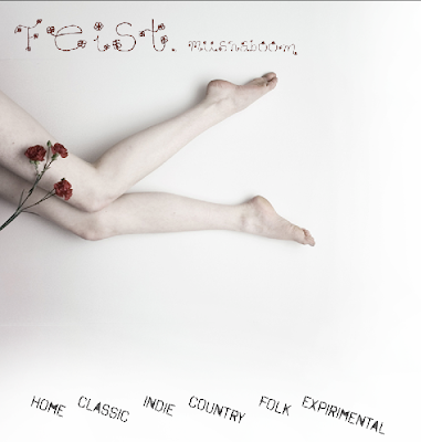
For example: This was a page I did for the song "Mushaboom" by Feist.
The background picture is not my own photography, but rather borrowed for educational purposes from deviantART. Like I said, if I had different circumstances, I would most likely have done some other type of photography or designing to represent the song because you feel so much more accomplished when you can really call something your own.

Another example would be my use of different fonts you can download from dafont or 1001 Free Fonts. Going back to my music website, the homepage (which I linked above) uses a downloaded font.
In the case of fonts, I am not sure that I would create my own. I'm not sure why I feel differently about fonts either. Someone still took the time to delicately and deliberately create this font and it is considered a form of art. Maybe it has to do with my lack of expertise in creating fonts, or typography. But on the other hand, both of these websites are royalty free and people who upload these amateur (yes they are amateur) typefaces know that they are basically giving away their creation probably in hopes that it will end up someone widely seen.

Going back to my first example, deviantART is not necessarily there for taking people's creations, but for visually sharing them with the art community. People who do not want their items taken can write it in their description or they put large watermarks on their artwork so people can't use them. Actually, that system is kind of like CC in terms of sometimes in the description people say yes, you can use it, but no, you can't make money off of it and so forth.

My last example is a moodboard I made for my sign symbol image class. This moodboard basically lays out what kind of mood, objects, characters, lifestyle, history and so on, I want to incorporate into my final project, which will be a flag for a imaginary nation.
All of these images where take off of googleimages, deviantART, pixdaus, and flickr.

Side note here, I finally saw the CC copyright in use, it's on the homepages of the flickr website. Interesting.
Moodboards are supposed to be just a compilation of images that you gather, so in terms of copyright laws, is that illegal? I'm not sure.

You know, I'm actually surprised at how little Columbia has talked to me, maybe others, about copyright issues. I mean, that doesn't include plagiarism in terms of writing papers, but in using images in your design projects. Until I read that fair use thing, I really didn't know that what I could be doing for school could be illegal.


Students/Professionals, which one looks scarier?

I think when I get to my professional life, it will be different. I feel like when your designing for a company you work for, it is a necessity to make your own original work no matter how little time you have because you are representing the company. I know this might be a little one-sided and that I'm representing Columbia College, but to me it seems okay to borrow other work for school as long as, you know, I'm not parading around saying oh yeah I made all of that, which I don't.

School just seems, obviously, more like I'm learning how to do all these things at once, a profession seems like it will be more concentrated so your brain won't be all over the place; you can better manage your time and your designs.

Read, Heard, Saw


So the Creative Commons is a service of sorts. They provide the cultural, educational, and scientific communities with the ability to share their work in "the commons". This is because in the late 80s, the US law had changed from having to put the copyright symbol on anything you wanted to protect your rights on to, after creating/making anything, automatically copyrighting it with "all rights reserved". The creative commons is a free service where you answer a few questions about how you want your work to be used and they create a unique copyright counterpart so as they said, you can skip the intermediaries.

Actually, that entire description I just wrote, is new to me. I never knew that anything I made, from the point I clicked save, was automatically copyrighted with all rights reserved. I also never knew that there was a counterpart to the copyright system that put sharing on the internet in a good light. Everything we've been talking about in class has been kind of put in a bad context... like Wikipedia is bad, and internet sharing/downloading/pirating programs are bad, and who is more original, the guy who makes the mixes from others' work or the guy who mixes his own original music?

I thought it was interesting that this Creative Commons really put sharing in a good context. They were literally like people want to be able to expand their artwork, their community, their knowledge by sharing what they creatively have to offer and take others' creative works and turn them into something else. It was almost relieving to hear this. I think our conversations were starting to make me feel a little claustrophobic.


"What is fair use?"
(if you can't read it)

So on the other hand, the fair use deal-io was something I had heard a little about. In my advertising class last semester we had to talk about using pictures for our ads during class projects. We discussed fair use in that we could borrow certain images since we were not making any money and the ad would not be widely seen. Also there was always the option of buying your picture for your homework which the OWL site discusses as the safest way to use fair use in terms of the law.

What was a little weird to me was the paragraph that is on partial use.
The use is partial.

Reproducing only a small part of a copyrighted work is more acceptable than using an entire work. Try to use less than 10% of a movie, television show, music, or other media. Though image use does not conform easily to this standard, consider using only a few photos or illustrations rather than an artist’s entire collection. As a rule of thumb, using a smaller portion of a work is more likely to be protected. Furthermore, take only what is necessary for the purposes of the new use.

Just where it says try to use less than 10% of the media you are working from. To me, it sounds kind of like a medical procedure where you only need the femur bone out of the body. It's like taking a page, like above, from a typebook I made but only using this much of it

But if that's the way fair use works, then so be it!

All in all I was much more interested in the videos Creative Commons had to offer. I like their take on sharing and I like how they are providing the creative community with a new, legal way to build a network around their creativity. I also greatly enjoyed their first video, I thought it was an interesting, modern way to show what they were talking about.

Followers