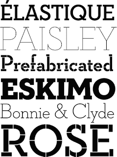
I found it interesting and compelling that this typeface was based on a place.
Another video that I found really interesting. It's for Cordial Bloom which has many different family "members" that I've seen over the last three years.
This part of the family is very ... extremely .... ornate. I have no idea what I would use it for in practice, but again, I thought the video was great.
This is a typographic calender that I found interesting. I love the simple, yet complex design of it. Simple in color scheme and layout, and complex detail in the typography. I really enjoy that scribble font. Seems very anti-"the man" in a typographic sense.
Here's some pretty cool packaging (found on the dieline.com) with a label almost totally based on type. I like the elongated features of the typeface, the handwritten feel of it...
I also like the "off-centerness" of the typeface, it gives this package the go-green feel in full.
I love this coffee mug! One, helvetica is the everlasting font that's pretty much good for anything. Two, I love coffee and the play on words is awesome. Three, it just makes me want to buy it. I love the intentional white space giving full attention to the typeface.
This neutraface slap from houseind.com is gorgeous. I love the different weights and the different way this font is explored. The top one probably catches my attention the most. The symmetrical o's, the lowered bar on the capital e, the serif tail of the q.
I like this play on the warning tape. I would definitely buy and use this to put a comical spin on my artwork. Whether to tape a present, use it to matte my work (meaning the tracing paper and the brown paper on the back), or simply as artist tape, I think it would just remind me why I became a designer; aka to be me, to be silly, to do something I love. to have a level of seriousness and a level of non-seriousness.
Yet another package based on typography, this revamped label has a mountainous feeling to it, almost as if you don't buy it, it will crush you and if you do buy it, you'll be crushed by its deliciousness anyway. And I get that feeling because of the heavy cap typeface it uses.
Awesome advertising too.
Beer me. Seriuosly. This design makes me want to purchase the product. I picked this, one, because its based on typography again as it seems that's the going trend these days, and two because its a display of low budget green design. They have 4 different flavors and the only thing that changes is the glossy dual color sticker. I love the slab serif typeface and I love how they made it their own by manipulating the "u" in the name.
And finally...
This is awesome. Not necessarily because helvetica is used once again, but because its just so ... dorky yet insanely cool for any serious designer. I would buy that shirt.


No comments:
Post a Comment