Monday, October 26, 2009

Sampling Appropriating Borrowing Mashing Aggregating


When it comes to my personal life, and I'm sure many others' at Columbia, I do sample, and so forth, from other people's works. If I was a millionaire, if I didn't have to work forty hours a week to support myself, and if I had the time, the situation would be different.

If my life consisted of those circumstances, I would most likely create all original work. I say that in the form of I wouldn't borrow others' creative work to incorporate in my school projects, not original as in the idea because I'm not sure that's possible anymore.

For instance, in my web design class, we had to create a music website. This website (I would link it if I had it up and running, but the code is completely messed up. But maybe when I fix it I'll add it later) consists of five different genres of music. For each genre I had to create six, which includes the homepage, different designs in Adobe Photoshop. We had one week to do this. This was on top off my two other very demanding design classes as well as two other academic classes. Insanity right?

I thought so. With work, classes, other homework, the only way I was going to get it done was if I borrowed other creative work.

For example: This was a page I did for the song "Mushaboom" by Feist.
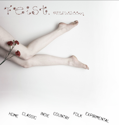
The background picture is not my own photography, but rather borrowed for educational purposes from deviantART. Like I said, if I had different circumstances, I would most likely have done some other type of photography or designing to represent the song because you feel so much more accomplished when you can really call something your own.

Another example would be my use of different fonts you can download from dafont or 1001 Free Fonts. Going back to my music website, the homepage (which I linked above) uses a downloaded font.
In the case of fonts, I am not sure that I would create my own. I'm not sure why I feel differently about fonts either. Someone still took the time to delicately and deliberately create this font and it is considered a form of art. Maybe it has to do with my lack of expertise in creating fonts, or typography. But on the other hand, both of these websites are royalty free and people who upload these amateur (yes they are amateur) typefaces know that they are basically giving away their creation probably in hopes that it will end up someone widely seen.

Going back to my first example, deviantART is not necessarily there for taking people's creations, but for visually sharing them with the art community. People who do not want their items taken can write it in their description or they put large watermarks on their artwork so people can't use them. Actually, that system is kind of like CC in terms of sometimes in the description people say yes, you can use it, but no, you can't make money off of it and so forth.

My last example is a moodboard I made for my sign symbol image class. This moodboard basically lays out what kind of mood, objects, characters, lifestyle, history and so on, I want to incorporate into my final project, which will be a flag for a imaginary nation.
All of these images where take off of googleimages, deviantART, pixdaus, and flickr.

Side note here, I finally saw the CC copyright in use, it's on the homepages of the flickr website. Interesting.
Moodboards are supposed to be just a compilation of images that you gather, so in terms of copyright laws, is that illegal? I'm not sure.

You know, I'm actually surprised at how little Columbia has talked to me, maybe others, about copyright issues. I mean, that doesn't include plagiarism in terms of writing papers, but in using images in your design projects. Until I read that fair use thing, I really didn't know that what I could be doing for school could be illegal.



Students/Professionals, which one looks scarier?

I think when I get to my professional life, it will be different. I feel like when your designing for a company you work for, it is a necessity to make your own original work no matter how little time you have because you are representing the company. I know this might be a little one-sided and that I'm representing Columbia College, but to me it seems okay to borrow other work for school as long as, you know, I'm not parading around saying oh yeah I made all of that, which I don't.

School just seems, obviously, more like I'm learning how to do all these things at once, a profession seems like it will be more concentrated so your brain won't be all over the place; you can better manage your time and your designs.

Read, Heard, Saw


So the Creative Commons is a service of sorts. They provide the cultural, educational, and scientific communities with the ability to share their work in "the commons". This is because in the late 80s, the US law had changed from having to put the copyright symbol on anything you wanted to protect your rights on to, after creating/making anything, automatically copyrighting it with "all rights reserved". The creative commons is a free service where you answer a few questions about how you want your work to be used and they create a unique copyright counterpart so as they said, you can skip the intermediaries.

Actually, that entire description I just wrote, is new to me. I never knew that anything I made, from the point I clicked save, was automatically copyrighted with all rights reserved. I also never knew that there was a counterpart to the copyright system that put sharing on the internet in a good light. Everything we've been talking about in class has been kind of put in a bad context... like Wikipedia is bad, and internet sharing/downloading/pirating programs are bad, and who is more original, the guy who makes the mixes from others' work or the guy who mixes his own original music?

I thought it was interesting that this Creative Commons really put sharing in a good context. They were literally like people want to be able to expand their artwork, their community, their knowledge by sharing what they creatively have to offer and take others' creative works and turn them into something else. It was almost relieving to hear this. I think our conversations were starting to make me feel a little claustrophobic.


"What is fair use?"
(if you can't read it)

So on the other hand, the fair use deal-io was something I had heard a little about. In my advertising class last semester we had to talk about using pictures for our ads during class projects. We discussed fair use in that we could borrow certain images since we were not making any money and the ad would not be widely seen. Also there was always the option of buying your picture for your homework which the OWL site discusses as the safest way to use fair use in terms of the law.

What was a little weird to me was the paragraph that is on partial use.
The use is partial.

Reproducing only a small part of a copyrighted work is more acceptable than using an entire work. Try to use less than 10% of a movie, television show, music, or other media. Though image use does not conform easily to this standard, consider using only a few photos or illustrations rather than an artist’s entire collection. As a rule of thumb, using a smaller portion of a work is more likely to be protected. Furthermore, take only what is necessary for the purposes of the new use.

Just where it says try to use less than 10% of the media you are working from. To me, it sounds kind of like a medical procedure where you only need the femur bone out of the body. It's like taking a page, like above, from a typebook I made but only using this much of it

But if that's the way fair use works, then so be it!

All in all I was much more interested in the videos Creative Commons had to offer. I like their take on sharing and I like how they are providing the creative community with a new, legal way to build a network around their creativity. I also greatly enjoyed their first video, I thought it was an interesting, modern way to show what they were talking about.

Tuesday, October 20, 2009

Vanity Press


"In the areas of computer programming and open source, as well as astronomy and ornithology, many amateurs make very meaningful contributions equivalent to or exceeding those of the professionals. To many, description as an amateur is losing its negative meaning, and actually carries a badge of honor."

This is part of the definition of amateur on Wikipedia.com which was written by these so called "honorable/noble" amateurs.

Keen, a few paragraphs down, then reported, "In the July 2006 issue of The New Yorker, Stacy Schiff wrote, 'Wikipedia may be the world's largest most ambitious vanity press.'"

Vanity is self-love. It can also mean pride, arrogance, and cockiness. What I got from reading that part of Keene's chapter is that these Wikipedians love to love themselves. And why do they love themselves? Because writing and editing on Wikipedia makes them "experts" on common knowledge. It seemed like Keene was trying to say that Wikipedians think themselves better than the experts who actually write books, articles, etc.

To me, that says vanity. There's definitely a swagger in the step of lifetime commitment "blood-bros" bond that some people make to the website. Obviously we're only reading from one point of view, Keene's, but I think he is making a very valuable point in our authorship crisis topic.

Here's an example of how the article can change...

Wikipedia has been recently dealing with 'fake' vanity problems, the people who register themselves as ivy league college graduates when really they're high school drop outs with maybe a GED. If that's not vanity, I'm not sure what is.

These people are saying, "hey look I'm so smart and professional and smart and professional... wait did I already say that?" which is buffing up their ego on the web. It may not do much for them in the real world, but it doesn't seem like hard core Wikipedians really stay much in the real world. So people pretend to be these amazing experts (amateurs as they like calling themselves which Keene thinks that, between the lines, that really means expert in their book) and all the creator of Wikipedia, Wales, has to say is, "I regard it as a pseudonym and I don't really have a problem with it,". But it's a pseudonym that is giving people credit for something they never accomplished. It is bolstering their heads with juicy pride of their own work, when really it is all an act.


So do you think Wikipedia is a vanity press? I do. Vanity press because it is a scandalous article making machine monster with thousands of prideful web 2.0 slaves rowing the oars thievery on a sea of lies (sorry for the very bad cliche) or maybe a sea of common -on occasion or unknown- plagiarized knowledge. I said thievery because this whole subject does have to do with authorship and who would know if "Essjay" the Harvard graduate theology professor/young adult high school graduate just took a few lines from an article here, a few lines from a book there, to edit his thousands of Wikipedia articles. Who would know? You wouldn't, I wouldn't, Wikipedia wouldn't.


Yes, Wikipedia is a vanity press where people pride themselves in writing common knowledge and pilfering the shoes off the experts who took the necessary steps to truthfully make knowledgeable and cited pieces of writing.

I also just saw that vanity press, according to the Merriam-Webster Dictionary, is a publishing house that publishes books at the author's expense, I might have taken the wrong direction in the answer to this question, but I also think that since the authors of Wikipedia aren't dealing with money, that the vanity press for Wikipedia is a different 'species' per se and needs a different kind of answer.

And I don't think everyone who writes for Wikipedia plagiarizes, I'm just saying it happens and there isn't much anyone can/will do to monitor it. Authorship and Wikipedia don't exactly have a mutualistic relationship.

Monday, October 19, 2009

Dictatorship of Idiots


Let's consider the “Dictatorship of expertise” vs. a “dictatorship of idiots” as referenced out of the book The Cult of the Amateur by Andrew Keene.

Keene, first of all, writes this statement in reply to, "these 'noble amateurs' would democratize ... the dictatorship of expertise" made by "a Friend of O'Reilly" in 2004. What they are talking about is the authorship crisis of present day. This is a cascade of events tumbling passed Web 2.0 aka sites such as Wikipedia. This also includes blogging in terms of being able to cut and paste anything you want off the web and call it your own.

As it seems, this friend of O'Reilly, seems to think that this is a, "...most 'awesomely' democratic consequence of the digital revolution". Keene seems to disagree.

So what am I, you, or anyone else thinking about this dictatorship of expertise vs the dictatorship of idiots? Well I think the dictatorship of expertise is as it reads, the books we learn from, the articles we read online, newspapers, etc. are/should be written by experts. Dictatorship only means that, before the web, this is all we had to go on when we went to the library, therefore there were only a select amount of "dictators". Since these experts always sounded much more intelligent than the average student, plagiarism was easy to spot and citations were necessary to make.

So with Keene's reply of the dictatorship of idiots, in relation to "noble amateurs", I take this as the average hobbyist taking over the spot of the experts. Today, any average person can write a whole freakin' book in their blog and 3\4 of it might be taken out of one (or many) other book(s). Keene mentions Wikipedia where a whole horde of authors constantly edit and re-edit these articles on basically everything the world has to offer, and they really don't even have to cite. Of course there are citations at the bottom, but how are we to know if that covers everything? Are they telling the truth? You can't even cite Wikipedia with an author because you have no idea who, or how many who's, are writing.

I think the whole reason Keene calls these people idiots is because we aren't getting any smarter by stealing other people's words. Our brains are not expanding with the beautiful self-inflicted practiced knowledge and writing style that only comes with truthful practice.

Keene says that basically the world is turning up-side-down as we speak; that we are reading and more constantly learning from these "noble amateurs" rather than the traditional experts which used to be the habit before Tim Berners-Lee (no! he is not excluded from Wikipedia) invented the web. Keene might even say that Berners-Lee was probably the last expert to ever live, because it all seems to go downhill from there.

The problem lies in the effortless way we can reach, copy and paste, and print online documents. This problem is obviously not making us any smarter, and as the rise of web sharing continues, the rise, rule, and "dictatorship of idiots" will continue, probably until the experts stop writing and the world starts recycling material (then we'll really be in trouble!).

Tuesday, October 13, 2009

Blog Template

Original Template: Green Machine

I love the color green. It seriously tickles the happy nerve in my eyeball. No, I don't care that green basically covers everything on the land, except for you know, deserts and maybe Forks, Michigan, but I love it. Aesthetically, I think it calls attention but it's not yellow, therefore its not like you're being cautioned to enter. Green also is an extremely calming color; it means life, growth, renewal, harmony, etc. It pleases the eye naturally, whether you like it or not (at least so say the crazy-people doctors). Substantively, if I'm getting the meaning correct since I wasn't in class (possessing substance; having practical importance, value, or effect) I think having a fill color of green in the background portrays my aesthetics in a substantial way. It gives my words more umph. It also neutralizes my words (especially in my personal blog) because of the color. It's not too green due to the box that the post is in which is a ncie light beige. Even the slightly darker diagonal stripes lead you to look at the post itself.
Second Template: Heaven ... ?

Gross! This template does nothing but remind me of boring books I had to read in high school, or maybe the end of semester exams, both were awful. But unlike my green template, this doesn't give any substance to my words. It makes it seem boring because its visual connotation is exactly what I said before, something like a test. It makes it seem like a chore to read it. Beside that, the whole align center symmetrical thing that's going on reminds me of green-thumbed type designers in the 1800s and their book printing techniques. Yuck. From the color definition, white is supposed to mean light, goodness, and purity but I don't think any of those feelings come across when looking at this. Maybe if it was shaped like an angel... There is no substantive nature because to me it seems as if a white background makes the blog seem less valuable, like it's not worth your time, like it is transparent to the giant universe of the internet.

Current Template: The Dark Side

I think this template is okay. Aesthetically I really like the contrast. It's easy to see the blog name at the top and it uses a color scheme that includes... green! which is used for the headers. I think black is very safe because anything will pretty much look good on black. Black signifies power, elegance, formality, death, evil, and mystery. I think in this context my blog looks slightly more powerful, just because of the color. The color more has to do with elegance and formality than death and evil. Unlike the white background, the black gives the words some substance. I look at the white like more of a hole than the black. Unlike the green, it loses its calming feeling. Like I said before, black means elegance and formality which in the substantive context pertains greatly to practical importance especially in the context of this blog for class. If I were to use this for my Beatnik Babble Broadcast blog I think it would look too formal. You probably wouldn't laugh at my bad jokes and sarcasm.

Monday, October 12, 2009

My Top 5 Tips for Blogging and Such

Tip #1- Use a Color Scheme (including your links)

Reason:
Using a color scheme means that your blog will most likely be more interesting to look at. Have it all one color is boring, pick three! (or something along those lines). If you're bad at picking a color scheme feel free to visit the Home Depot paint section and/or the adobe illustrator color guide (absolutely wonderful for design purposes). Making use of this aesthetic function will better direct your viewer and probably keep them reading for longer, as long as your content isn't completely abysmal.

Example:

Tip #2- Use Pictures that Grab Attention


Reason: They grab attention. They don't have to necessarily make sense, they just have to have some funny relation (or something along that line) to what you're writing about. It will keep your readers reading. It will make them laugh.

Example:


Tip #3: Italicize and Bold for Emphasis

Reason: It's better than WRITTING LIKE THIS WHEN YOU WANT TO GET SOMEONE'S ATTENTION because that just looks like you're yelling, and no one likes to be yelled at. So of you want to tell your reader that such and such was so funny or that this is the point you're making period (or to show a certain part of your post under a heading) use italiceze and bold your words.

Example:


Here we have a bold heading and "no idea"
in italics to emphasize some sort of stupidity.


Tip #4: Use a San Serif Font

Reason: San Serif fonts are more legible, in my opinion than serif fonts. Also, to use a blog you have to have internet and a computer and modern tech skills - the important word here is modern (italics!). I just don't think most serif fonts are modern and aesthetically do not suit blogs. Also the serif fonts that are contemporary probably can't be used on the web.

Example:
Tip #5: Use Witty/Sarcastic/Ironic Remarks

Reason: Even if you have a political/social/entertainment/economical/food/boring blog, you can still be a smart ass. One - you're readers probably aren't suspecting it if you don't tell them in you're blog description. Two - they will remember this surprising comment. Three - they'll probably share it with their friends which will ultimately get your blog looked at more often. Four - people need to lighten up, the economy is a mess.

Example:


This blog was nominated by Time as the top blog out there. In that little excerpt they say, "But in surprisingly short order, HuffPo has become one of the most popular and widely quoted sites on the web, its influence easily rivaling that of many mainstream media outlets. HuffPo's megamix of mostly liberal professional columnists, celebrity dimwits, political visionaries, party hacks, uncomfortable truth tellers, marginally successful but still struggling freelance writers, and just plain folks seems absurdly haphazard, but has proven to be the web's killer editorial model".

By the way I thought this sample excerpt was funny, "
The fact remains: the surge is not working. Indeed, it is an abject failure on many fronts...Just as the Athenian army was lost in the quarries of Sicily, the American army is being lost in the deserts of Iraq."

Monday, October 5, 2009

Crooks and Liars, Composition and Layout 2

Effort? Modern? Personality? These are some of the one word questions I'm going to use for this blog post, based upon the Crooks and Liars website design. Soooooooooooo...


Question:
Does it appear to me that EFFORT has been put into the design of this website?
Answer: I would say yes, it does seem that they put at least a little effort into this. It's hard to tell though because they might not have designed it themselves, they may have had someone else do it. And if that was the case then maybe they didn't tell the real designer what to do, let him wander on his own creative path, therefore not putting any, zilch, sip, effort into the design. But then of course they may have told this person what to do or maybe even did all the designing themselves.

If thats the case, then yes I would say that they took the appropriate measures to ensure that their website was not some god awful piece of crap that no one would look at for more than five seconds. That's what it's supposed to do. This isn't one of those crazy Coke interactive viral advertisements with midgets. This website wasn't made for a design competition, it was made for people who want to hear the news, so based on that I think we should all take it a little easy on the critique.

So yes, I see the effort. Beige screams news. Also they have, in the header, a "top videos" bar which is interesting. It made me watch the SNL Obama spoof which I wouldn't have seen otherwise. It's organized well, meaning that before you even think of scrolling down your eyes do a little swoop, transmits all that info to your brain, and then your brain decides whether you want to stay there or not. When I first looked at the site, I definitely thought it was worth staying at.


Question:
Is it modern?
Answer: Yes I would say its modern. Its not bit-mapped and pixelated like 1992 but it doesn't necessarily fall into a certain trend that passing through. It reminds me of the Good Morning America website which I would say is also modern.


Question: Does it have personality?
Answer: Not really. One thing I think that does though, is the name of the website in red white and blue which gives the whole website a political feelings and adds to personality. Otherwise, I don't really think this site would stand out on its own. It's beige, enough said.

Friday, October 2, 2009

Crooks and Liars, Competent Content 2


So this week I wanted to delve more narrowly into the content of the same blog Crooks and Liars. Maybe I'll ask myself some different questions and give you a more definite reason as to why I like this certain blog.

I guess first I wanted to start out writing about what makes me like a blogs content? Well first of all, I like news blogs, obviously since I write one. But in terms of another blog, unless its a subject I'm extremely interested in, I don't really want to read a blog like mine where silliness and semi-obnoxiousness takes away from the cold hard facts of the news. I really content myself in learning about what is going on in the country.

Secondly, I like a blog where each sentence and paragraph leads you into the next in an easy-to-read fashion. I really find it annoying when a blogger and/or person I'm even talking to will be saying something about the War in Iraq and then without discretion to my eyes and mind, starts talking about what kind of underwear they are wearing.

Next, in the simplest form, if you aren't spelling words correctly and your grammar is awful, I'm just not going to give your blog the time of day. I know that my blogs probably aren't perfect in spelling but I do try. To those who don't try, you need a kick in the ass.

There are some other things that make me like the content of a blog but let me furnish those ideas when I talk about this blog.

So my intention right now is to carefully read to posts at this blog site by two different authors and go deeper into their content then I did before.

The first post I read is by Susie Madrak, called For $503 a Year, Members of Congress Have a Top-Notch Hospital On Call in the Capitol. But They Don't Want Government Care? Really my one and only qualm with this post is the lengthiness of the title. I think she could have shortened it up a bit, maybe added a punch to it to draw readers in.

Otherwise, the post opens up with a video from youtube showing three republican congressional representatives giving there reasons why they do not want the government to take over or change health care. I thought this was a very good choice because

1) I can give this video 1 minute of my time and know what she is talking about
2) it gave me faces as to who she was talking about, which I thought made it more memorable
(personable is not the right word here)
3) she can then dive right in to the news-related facts

After the video she writes, "From time to time, we're reminded of the fact that members of Congress -- many of whom are fighting to kill health care reform -- give themselves pretty good coverage. Several weeks ago, the LA Times reported on the taxpayer-subsidized insurance federal lawmakers currently enjoy.

The piece noted that, while most Americans have to go with whatever their employer offers, members have a choice of 10 plans that offer access to a national network of doctors."

I thought it was well written; it doesn't, from my knowledge, have any mistakes in it grammatically. And then after picking out some wonderful words from ABC News, she goes on with her opinion on the matter. I thought she really held my attention throughout the whole thing which is the biggest thing I look for. On top of that, yes she includes her opinion, but it is so slight that it's like it isn't even there. She is basically giving you the facts and saying "HEY YOU! WATCH OUT FOR THIS!" But I definitely got a feeling of the opinion beneath all these words, that she thinks these congressman have their heads up their arses and only care about themselves.

I like that. Not too much opinion, straight facts, clear and concise. Beautiful.


The next blog is by a guy named John Amato, who titled his post, "Michelle Bachmann's insane "Sex clinics and abortion" rant. Firstly, I feel like titles need to be capitalized, not just pronouns.

So this guy also opens up with a video, which seems to be a theme on the website. My problem with it is that it doesn't seem like a rant to me... it just seems like she thinks what she thinks and no one will persuade her otherwise. After the video Amato writes, "Michele Bachmann, one of the sickest members of Congress that we've ever seen, keeps up the crazy talk when she lies about what's in the SBHC" See, I liked the previous blog better because her opinion was embedded in the words, not just flat out there like this one.

Next, I thought this post was a bit hard to follow. The video clip was kind of cut in an awkward way so when I saw it, I had to pause it and re-read the title and the first sentence before I understood how they went together. After the author's opinion rant, he just quotes what the lady in the video says which I think is probably unnecessary. Then he says and so and so reports - something about why the lady was wrong and ranting... but if you didn't really already have a grasp on what was going on with abortion in the world, I think it would have been harder to understand. Thank goodness in the next paragraph he kind of explains what's going on; that having health clinics for school make healthier kids and therefore succeed, but unless you understood what the lady in the video was saying, all of this would be one big mumbo jumbo.

So basically I don't like this post at all because it does not have an efficient, easy to read/follow structure like the previous blog. There is also too strong of an opinion, I think, too soon. I think to have that kind of opinion you have to explain it better, not just shove it on to people.

Followers